
How to Choose the Perfect Color for Dining Chairs – It Solves 99% of Your Styling Problems!
- Sunbin Qi

- Apr 1, 2025
- 5 min read
I often say: furniture isn’t just for sitting—it’s for feeling.

And color is the first thing your customers will feel. It’s the first impression a dining chair makes—whether in a product photo, on a showroom floor, or next to a breakfast nook in Munich. At ASKT, picking a color for a chair isn’t a lucky guess or a seasonal whim. It’s a journey. A combination of cultural research, material testing, emotional resonance, and, honestly, years of conversations with buyers across Europe.
Let me take you inside the process—how we choose our pops of color, and how it helps you choose the right chairs for your customers.
Where Our Color Inspiration Comes From
Design Starts in Real Homes
We don’t sit in a room and stare at color wheels. We travel. We visit homes, cafés, showrooms in Germany, the Netherlands, and the UK. I personally love visiting family-run restaurants or staying in Airbnb apartments in cities like Cologne and Utrecht. That’s where you see how people really live—and how they mix comfort with expression.
Every year, we also attend fairs like imm Cologne and Maison&Objet, but trend reports are just a starting point. What matters more is how those colors feel in context.
What’s Trending Now: The Mood Behind Today’s Popular Colors
This year’s color landscape is not about being loud—it’s about being intentional.
We’ve moved past the high-saturation, Instagram-filter tones. Today’s bestselling chair colors lean toward earthy, grounded, emotionally rich palettes that fit into real-life spaces, whether it’s a sleek Berlin apartment or a warm countryside cottage in the Netherlands.
Here’s a look at the current style directions that are resonating in our top European markets:
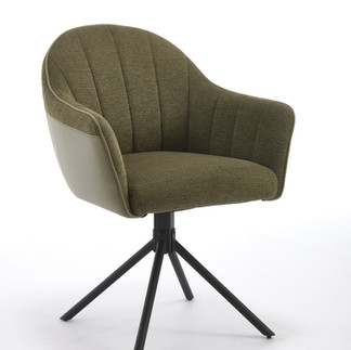
🪨 Earthy Neutrals — “Calm is the New Bold”

Picture a softly lit dining room in Hamburg: linen curtains, pale oak floors, and a matte beige ceramic table. Now add a sage green velvet chair with matte black legs.It doesn’t shout—it whispers confidence.
These tones blend into nature: stone, clay, moss, fog, bringing serenity into the home. They're subtle, but when paired right, they’re unforgettable.
Popular combinations:
Sage Green + Beige walls + Black metal frames
Charcoal Gray + Oak floors + Chrome legs
Blush Pink + Soft white walls + Walnut wood
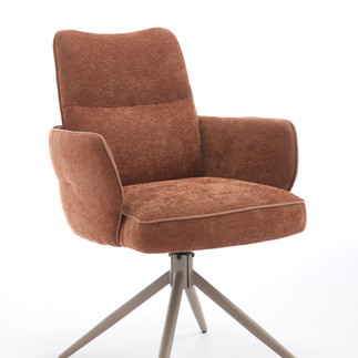
🔥 Retro Warmth — “Color as Comfort”

Think terracotta, mustard yellow, and olive green. These aren’t just throwback tones—they’re emotionally comforting. They're what a cozy corner café in Amsterdam might use to create warmth and familiarity.
Visualize:A rustic dining table under pendant lights, surrounded by mustard yellow velvet chairs with black legs. There’s coffee, soft jazz, maybe a croissant.
These colors connect with the rise in retro-modern interiors: warm wood, vintage-inspired lights, soft textiles.
Pairing ideas:
Mustard + Walnut frames
Olive green + Black or brass legs
Terracotta + Vegan leather + Ash wood
🌊 Cool Luxury — “Moody, Modern, and Intentional”

For urban interiors, colors like deep navy, storm gray, and dusty blue offer a quiet elegance.
Imagine a high-rise flat in Frankfurt with floor-to-ceiling windows and a concrete table. Now place four navy blue PU chairs with brushed brass frames around it. It’s sophisticated. Grown-up. A little bit moody in the best way.
These shades work best in bold materials like smooth PU, textured woven fabrics, or leather alternatives.
Color Isn’t Just Visual—It’s Emotional
We look at color like storytellers. Here's a quick breakdown of what certain hues mean in the spaces we design for:
Color | Feeling | Best Rooms/Markets | Pairing Tips |
Sage Green | Calm, rooted, elegant | Nordic, eco-inspired homes | Beige linen, matte black legs |
Terracotta | Warmth, nostalgia, Mediterranean charm | Rustic interiors, trendy cafés | Oak wood frames, vegan leather |
Navy Blue | Confidence, depth, classic luxury | Urban apartments, bistros | Gold piping, walnut frames |
Blush Pink | Softness, optimism, femininity | Boutique hotels, romantic homes | Bouclé fabric, white metal |
Charcoal Gray | Strength, neutrality, modernism | Minimalist interiors | Chrome legs, faux wool |
Mustard Yellow | Energy, cheer, retro vibes | Mid-century designs | Black frames, velvets |
Jade Green | Sophistication, freshness | Art deco-inspired interiors | Brass detailing, smooth PU |
This is more than theory. These color choices are based on actual test combinations and feedback from our long-term B2B clients.


The Harmony Between Color, Fabric & Frame
Let’s be honest—not all pinks are equal. A blush pink on soft boucle feels delicate and elegant. The same pink on a glossy PU? It’s loud, a bit plastic, and likely to be returned.
We consider:
Texture – Matte vs. shiny, soft vs. crisp
Light absorption – How it behaves in daylight vs. LED lighting
Tone pairing – Will it complement warm wood? Cool metal? Neutral walls?
And of course, the frame is key. The color of the seat only works if it balances with the legs.
Take our bestselling combo:
Blush velvet + black powder-coated legs = modern romantic
Jade PU + brushed brass frame = refined luxury
Charcoal fabric + natural oak = Scandinavian classic

So should the dining chair be lighter or darker than the table?
There’s no hard rule—but here’s what we’ve learned: contrast = elegance. A lighter chair with a darker table (or vice versa) gives clarity and separation. Too much of the same tone can look flat and uninspired—unless you’re going for an ultra-minimalist look.
Should Dining Chairs All Match? Let’s Talk Mixing and Matching
Short answer: They don’t have to match—if you know how to coordinate.
We’ve seen tremendous success with “color families” in dining sets. For example:
Three charcoal chairs and two sage green—all in the same fabric, same frame
A soft neutral base set, with two pops (like blush or mustard) at the heads of the table
Bar stools in a deeper tone of the dining chair color—creates flow without duplication
Mixing adds personality—but we always recommend maintaining one or two anchor elements: same fabric, same shape, or same frame. It keeps the set cohesive.
And about bar stools—should they match the dining chairs?
Ideally, they speak the same language. That might mean the same frame, or a shared color tone.
For example:
Dining chairs in terracotta velvet + black metal, and
Bar stools in charcoal velvet + black metal — perfect pairing.

What Color to Avoid?
Yes—there are colors we deliberately avoid.
Pure white PU – prone to discoloration, scratches, and rarely looks elegant in mass-market dining environments
Overly saturated reds or blues – these date quickly and don’t perform well in European e-commerce, unless used very carefully as accents
Neon or metallic finishes – more suitable for concept furniture, not retail volume
We always ask: Will this look good under natural AND artificial light? Will it still feel relevant two years from now? If the answer is no, we pass.
The Testing Never Stops

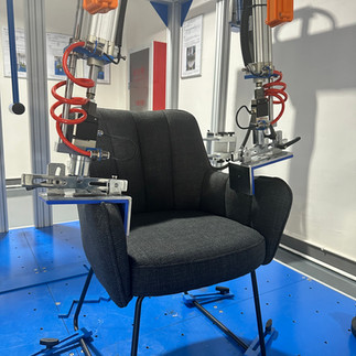


We’ve invested in 12 professional testing machines—but color testing goes beyond durability. We built six full lifestyle showrooms in our R&D center—each designed to mimic real European homes.
We place chairs in different setups:
Small kitchen with morning light
Moody dining room with soft shadows
Modern loft with cold, indirect light
Only after this do we greenlight a color to enter production. Because if it doesn’t look great in real settings, we don’t ship it.
Final Thoughts: Color Is a Trust You Hand to the Buyer
At ASKT, we spend months ensuring that every pop of color delivers not just style—but confidence. Because when our color choices make your product pages look richer, your customers feel like they’re making a smart choice—and they come back.

If you're a furniture buyer looking to bring more life, emotion, and sellability into your dining chair collection, let’s talk. At ASKT, we don't just follow color trends—we build them into products that move off shelves and into homes.
Need help selecting the right finish, fabric, or color combo for your market? I’m here to make that process easier—and more profitable—for you.
📩 Sunbin Qi CEO, ASKT Furniture
✉️ Email: sales@sinoaskt.com
🌐 Website: www.asktfurniture.net
📱 WhatsApp: +86 18912605997
Let’s create something beautiful—together.


Comments